Remodeling and Home Design

How To Mix Styles

Whether you are merging households, inheriting furniture, received a well-intentioned gift that missed the mark, or the occasional impulse buy -- all of these contribute to decorating dreams going haywire. And calling it eclectic doesn't help! And while you can't have it all, you can have some of it. Here's the recipe for getting the mix right and creating rooms that feel cohesive instead of crazy.
It is the 80/20 rule, and it works like this: as long as 80 percent of your interior is unified by the same style, same period or same philosophy, you can contrast with the other 20 percent. In other words, a vintage piece can absolutely work in an ultramodern space.

Continue to read below for more rules, dos and don'ts:

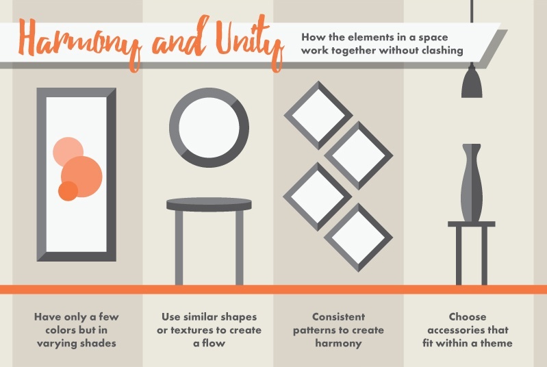
Color. Using a consistent color helps your decor hang well together and look more cohesive. If you have a traditional armchair, but want to add in a more modern sectional, choose a sofa in the same shade as your original chair.

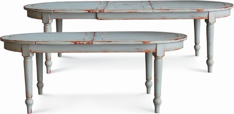
Mind the scale. Keep the scale of all your decor in the same realm. You don’t want a huge overstuffed chair sitting next to your grandmother's dainty wooden carved loveseat.

Find balance. Even though you have totally different pieces on either side of a bed, they can look balanced as a whole. Create the balance by choosing items with equal visual weight.

Distribute equally. If one half of the room is totally modern, and the other half is entirely traditional, the sudden difference is overwhelming. But if multiple styles are incorporated strategically throughout the room, it’s easier for the eye to accept.

Some styles just don't mix. For example, Victorian decor is all about ornate details, while Arts and Crafts veers more simplistic. Therefore, Victorian decor marries well with Traditional, Asian, and French Provincial furniture, while Arts and Crafts is better with contemporary pieces or country styles, like Shaker. But with the 80/20 rule you can mix almost anything. Say you have a loft filled with modern classic furniture -- add a superb antique settee and voilà!

When mixing woods, consider formality: mahogany, cherry and oak are formal, so they'll go well with one another. Pine, maple, and bamboo are casual choices, which means that they're compatible with one another but less so with formal woods.

When more than one rug is required in an open space, be sure to choose carpets that harmonize rather than match. Neutral sisal may work with a faded Turkish or Kilim rug but looks too humble beside a fine Persian, for example.

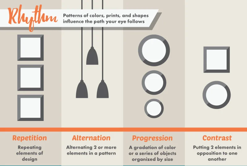
Traditional interiors tip the balance in favor of patterns. So if your family room is modern with monochromatic neutral fabrics, add some large patterned pillows. Conversely, a traditional pattern-filled room requires visual breathing space, so incorporate solid color accents.

Dos and don'ts of the 80/20 rule

DO revitalize neutral interiors with punctuation of color. A small addition of striking color, say, a series of vases in chartreuse or a pair of pillows in cobalt, can transform the mood and personality of a room.
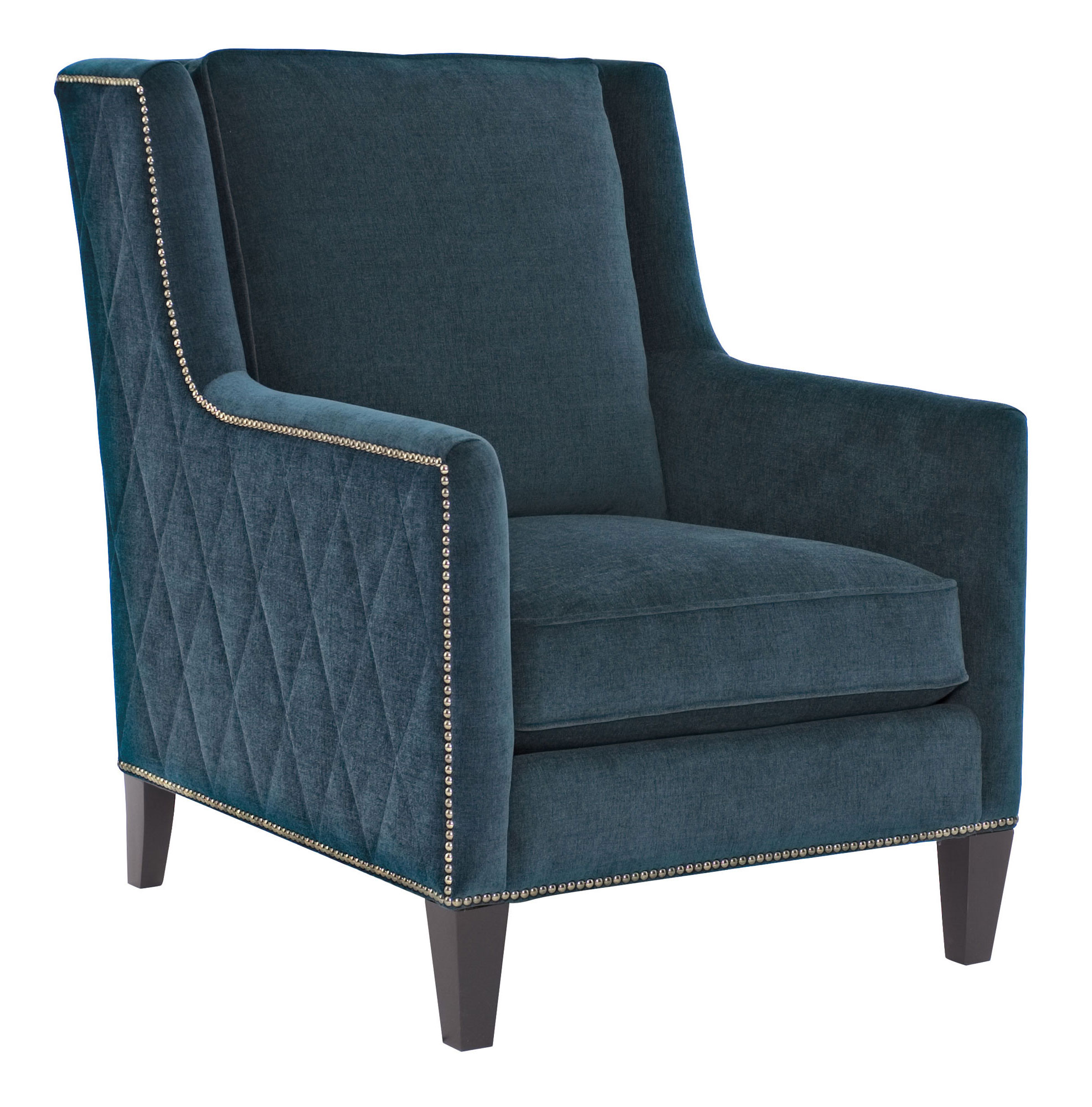
DON'T show too much leg. When mixing upholstered furniture and occasional tables, it's more attractive to vary the ratio of skirt to leg. In most cases, 20 percent skirting (either a soft skirt like the apron of a sofa, or a piece of furniture with no legs) is ideal.  

DO choose pieces with matching lines and shapes. Rolled armed sofas don’t necessarily like resting alongside boxy chairs and vice versa.

DON'T rely solely on ambient or general illumination for rooms. If 80 percent of your lighting is overhead, such as halogens or ceiling-mounted fixtures, for example, incorporate a 20 percent ratio of decorative lighting, like sconces, table lamps, art lamps and library lights, to create interest and draw attention to collections and paintings.

And lastly, DO have fun with it, but DON’T treat all styles equally.  Go heavy on one style of furniture, then mix in the other styles. If you have read through this whole post and are confused about what interior styles are or have no idea what style your home fits into go back and read our post on 7 of the most popular Interior styles today!

Happy Designing!

--DRH Team

Interior Design 101: 7 Popular Design Styles Explained

Looking to decorate your new home and seeking thematic inspiration? Search no more. I am covering seven interior design styles that are popular in modern homes today. In reality, spaces are blended with different elements from several decorating styles, but it’s crucial to identify the key components of each one. 

Obviously, there are far more interior design styles beyond what is highlighted below, but I wanted to focus on the major schools that are currently trending.

1. Mid-Century Modern

The mid-1900s produced some of the most iconic pieces in modern design. It is defined by refined lines, minimalist silhouettes, and natural shapes. From Saarinen, Niemeyer, Eames, Noguchi, Jacobsen, Knoll and many many more, the mid-century modern masters defined creative ways to use new materials like molded plastic, plywood, and aluminum in industrial design. Its pieces are highly versatile and can complement a myriad of design styles. This design style has continued to reinvent itself and resurface over the last 60 years. 

midcentury_modern.jpeg

Source: West Elm

2. Industrial

This is a look that dates back to the turn-of-the-century industrial era. It emphasizes use of exposed steel, pipes, ducts with distressed wood elements, often complemented by exposed brick walls. The modern version commonly includes copper-tone accents. Industrial decor ranges from modern rustic with cleaner lines to rugged vintage with elaborate embellishments. Depending on your tastes, you can opt for a lighter, chic look or a darker, antique design. 

Source: FRK OVERSPRINGSHANDLING

3. Nautical

Cool, relaxing, and easy to live in. Nautical decor (also referred to as coastal or cottage decor) reflects the New England beach house spirit and is truly one of our favorites! This interior design style is based on white or sand colored foundation, with blue as the primary accent color. Material-wise, nautical decor incorporates unfinished wood, combined with chic linen upholstery and nautical themed decor. Your options for decorative accents are many: seashells in clear jars, jute ropes, rowing oars, sailboats, navigational maps, and more!

This style is all about bringing the coastal life into your home. 

Source: Furnish Burnish

4.Scandinavian

Scandinavian design introduced a popular minimalist look to the interior design world that has proven its longevity.  A design movement characterized by simplicity, minimalism and functionality that emerged in the 1950s in the five Nordic countries of Finland, Norway, Sweden, Iceland and Denmark.  

Scandinavian design often offers a strong relationship with nature featuring gentle contours, neutral palate with playful accent colors, and a balance of engineered and organic materials, Scandinavian furniture are simple, contemporary, and functional. Many Scandinavian designs employ Bauhaus principles and is characterized by fluid lines, focus on proportions, and populist appeal. 

Source: Decoist

5.Bohemian

Bohemian decor captures the carefree and adventurous spirit of the avant garde gypsy lifestyle. It features creative application of rich patterns, vibrant colors, and plush texture. The key is to carefully present a purposefully “messy” look. Layer on textiles (throws, pillows, rugs, tapestry, and lots and lots of floor pillows) for a warm and cozy ambiance.

When furnishing, look for pieces that possess ethnic or nomadic vibes. Moroccan, Southwestern, or tribal-inspired designs are currently trending. Composition-wise, Boho chic loves textile, tie dye, wood, animal hide, plants, low beds with canopies, and metallic accents.

boho.jpeg

Source: Feng Shui Dana

6.Farmhouse

Farmhouse decor is a modern approach to cabin-inspired interior design however it is much more feminine with light and bright qualities. Mostly transitional in nature with some traditional elements mixed in. This style is extremely utilitarian being that it is a live and work space. 

Farmhouse furniture are characterized by distressed wood and upholstered linen. Color-wise, it is similar to nautical or cottage decor with mostly white and beige base colors mixed with key elements such as galvanized pitchers, large hurricane glass, and the most iconic apron sink. Orthodox rules dictate that accent colors should be something similar to turquoise or light yellow.

farmhouse.jpeg

Source: Homed It 

7.Shabby chic

Shabby chic decor emphasizes vintage elements to recreate the antique flea market look. The furniture is characterized by it's aged appearance, with distressed painted wood which is sanded down to show signs of wear and tear. 

Decorative accents for shabby chic decor should be soft and frilly, often with an affected feel, in order to bring the overall interior design to a contemporary standard. Inspired by the French, Linen is the fabric of choice and is commonly tea stained to enhance the antique feel. Though traditional shabby chic colors are white, ecru and faded pastels, don’t be afraid to apply some vibrant colors. Vintage floral patterns with pastel colors, cotton ticking patterns, or linen in earth tones, are all typical of shabby chic style. Variations of this style are: Cottage Chic, Beach Cottage Chic (yes, there is a difference :)), French Country, and Gustavian which is a Swedish influence.

shabby'.jpeg

Source: Houzz

That’s a wrap for the popular interior design styles! Hope this was helpful in getting you started in your next Interior Design project. Remember that all of these styles can be mingle quite nicely and is the best  practice to achieve YOUR personal style, so liberate your mind and approach your design from creative angles. Let me know what you think!

Stay tuned for our next edition of Interior Design 101: Traditional vs Transitional

Trend: Be Our Guest Rooms

Tis the season!

Guest rooms are a perky little plus to summer.  Either you're a guest and are able to get out of dodge and visit a friend or you're the host and have company on their way.

If you have an extra space on hand for visitors, or if your regular bedroom needs a summer time spruce, here's some fun inspiration and tips to get you started!

1. Pick a color/theme and stick to it.  White paired with a bright color is a simple and playful way to go.  Blue, Coral, Kelly Green all classic colors that look stunning with white.  Play with a few patterns/florals in shades of your color and you've got a master piece.  When in doubt, stick to one pattern, one floral and one texture and lots of white.

Photo Credit cococozy.com

I'd also have a light basket weave tray mounted to the wall in between the sconces.  Something earthy and round and a few feet in diameter.   Maybe a jute rug instead.  In love with the two stools at the foot of the bed!

2. Play with Pattern and neutral texture. Its the summer!  Allowing a statement upholstery fabric in a variety of colors take center stage is totally  welcome!  Linens and large fiber weaves along with a paisley or floral print balance eachother out and still feel breezy and warm.

Photo Credit brightboldandbeautiful.com

The best part is the fabric determines all the colors for your accessories.  Your walls and wall treatments are neutral, the carpet or area rug is neutral or selected in a calm shade from your print (as an example, pulling from this fabric I'd recommend a light grey, a soft chartruese, or a blue as light as the glass lamp on the side table).  Your accessories can then pull from the more bold colors in this palette.  And voila!  You have a cohesive and balanced room.
 

3. No size is too small.  Even if your guest room is a tiny space, it's still possible to create a comfortable spot with all the accoutrements of a lovely night away.   You have to be mindful of scale here.  See our previous post on how to achieve this.  Just remember to keep your decor neutral and simple.  Mirrors add visual space to a small room, add light and dimension.  Highly recommended in a small space.  They don't even have to be eye level, but they do have to relative in size to the rest of the room. 

Photo credit: theinspiredroom.com

Keep your patterns and curtains neutral and light and be sure to offer some sort of flanking bed side tables, even if they're tiny.  

4. Keep it simple!  Upcycling some vintage furniture and some fun little finds from your travels tells a story to your guests and gives them a worldly feeling while they're away from home.  You don't have to go out and spend lots of money to create a comfortable space you can be proud to share.  

theinspiredroom.com

Rustic is a huge trend and being that these pieces are generally well loved, you're not going to feel like this design scheme will be out of fashion any time soon.  Vintage books, antique framed art, and a pitcher of flowers makes you feel like you're in your PJs about to have some pie with grandma.  If that's not a break from the normal day-to-day, I don't know what is.  Your guests will love this.

Happy decorating!  Happy hosting! Contact us if you have any questions or if you need us to help you make turn these ideas into a reality!

Interior Design 101: Design Principles

This week I wanted to go back to the basics, Interior Design Basics. Do you find yourself flipping through magazines or Interior Design Blogs with wonder and amaze at each picturesque vignette and wonder how to make your own space just as beautiful? Some people have been blessed with a natural ability to see a vision and bring it all together effortlessly, and then there are others who don’t. Believe it or not you too can get that professional look with these basic principles, applying these can help you decorate a room like a pro.

  • Proportion and Scale
  • Lines
  • Balance
  • Harmony and Rhythm

Let’s dive a little deeper into each of these, and be sure to get our Intertior Design Quick Reference Guide down below when planning your next room!

Proportion and Scale

Proportion refers to how one object relates to another object in terms of size. For example, an oversized coffee table would be out of proportion if placed in front of a small scale sofa. Instead it should be paired with a sofa with a grandeur stature.

Scale refers to how an item relates to the size of a room. Using the above example the oversized coffee table would be best placed in a larger living room, if placed in a smaller room it would appear crammed and out of place. 

Note: Though they actually mean two different things, proportion and scale are often used interchangeably. Be sure to pay attention to the context so you can ensure you are seeing the same vision.

LINES

Lines define a space. Walls, floors, ceilings, and cabinetry all create lines in a room. Here are some important points to remember about lines:

  • Vertical lines can make rooms seem taller and wide spaces seem narrower; they lend an air of formality to a room and a sense of grandeur.
  • Horizontal lines do the opposite; they widen narrow spaces, bring the eye level down creating a sense of intimacy and are very contemporary.
  • Diagonal lines convey a sense of energy to a space.
  • Curved lines soften the sharpness of rectangles and squares

BALANCE

Balance refers to the symmetry of objects within a room. Balance can be created through shape, color, pattern and texture. A room that is well-balanced will feel comfortable and relaxing. There are 3 types of balance:

  • Symmetrical balance occurs when you arrange items or objects the same way on both sides of a real or imaginary line. One side mirrors the other. For example, a console with two chairs placed on each side of it. The chairs must be identical or at least the same weight and size.
  • Asymmetrical balance creates symmetry by using objects that have the same visual weight, but are different is size, shape, color and texture. An example would be placing a group of tall table lamp on one side of a shelf and putting a short, wide vase on the other side. If you keep the proportions correct, the grouping will be balanced.
  • Radial balance is achieved when you arrange objects around one central focal point. An example would be a round dining room table with chairs sitting around it.

HARMONY and RHYTHM

Harmony results when all the design elements relate to one another in some way, creating a visually pleasing space. One way it can be achieved is by using one color throughout a space, but in different textures, shapes or sizes. Or you can combine patterns and prints as long as they have the same scale, motif or color palette. They don’t have to match, just share something similar.

Rhythm is about creating patterns of repetition and contrast that move the eye around the room. It can be achieved by repeating the same color or shape at different areas in the room. For example, taking one color and picking it up in fabric or upholstery and again in accessories and artwork.

Sometimes it’s easy to see when an item is out of scale or proportion. Other times, it’s not always as obvious. You can help train your eye by studying photographs of professionally designed rooms. Really look at them to get a feel for why it works. Look at how the different elements relate to one another and what principles they are using from the list in this post. Once you have a good grasp on them, start applying these principles of design in your home. It may take some practice, but once you get the hang of it, your eye will naturally train itself to pick up on these things with less effort.

Happy designing!

~DRH Style Team

FATHER'S DAY BLUES

In honor of the men in our lives, DRH is exploring the timeless and classic color pallete of blue and white.  Cobalt, royal, cottage and everything in between, blue is a fresh scheme that will stand the test of time.

In any room of your house, blue and white stand as a crisp backdrop for interior decor.  If you stick to a neutral blue, then you're still in the safe zone to add many complementary colors with your accessories.  If you pick a bold and bright tone, you're better off accessorizing with neutral colors.

The span of blues available in paint can be overwhelming.  These are some of the most popular paint colors by Benjamin Moore.  Any of these with a bright white trim and molding and voilá, you are a decorating genius.

Here are some Darby Road HOME accessories and furniture pieces that are top sellers in our favorite regal tone.  It's a perfect time to come in and scoop something up for dad this weekend!  If he comes, we'll be serving craft beer!  It'll be an adventure!